See that finding a property to acquire and analyse becomes easier than booking one with the Smart Rental Pro Plus
Numbers below are provided for an example market.
This dashboard is very interesting to operate due to it's unique functional of the filters, allowing you to select a special area of your market with Lat and Long, and Radius of meters you want to analyse.
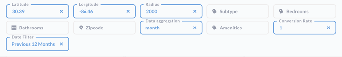
The market you're ending up with will always show-up on the map below:
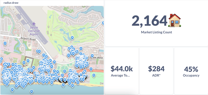
Rental Calculator dashboard begins with the overview of the market you have.
Let's take a quick overview of this dashboards main facilities section by section:
- Radius view – A map view based on specified coordinates with map markers of competitive listings
- Number of competitors – The approximate number of listings based on the filters
- Average total revenue – The average total revenue of listings within the specified coordinates
- ADR – The average daily rate of the listings within the coordinates
- Occupancy – The average occupancy rate of the listings within the coordinates
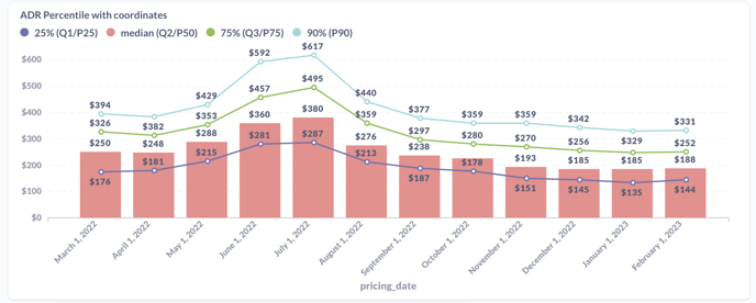
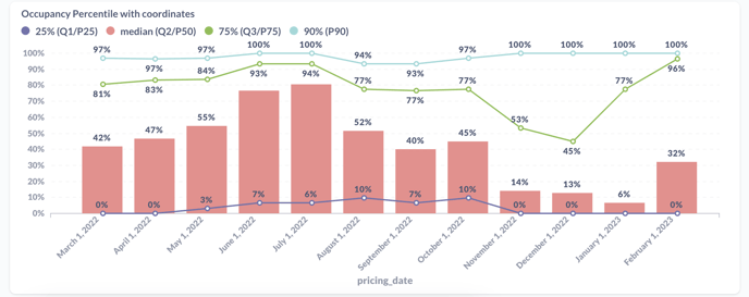
Further down you will see the percentiles of each property by 3 different metrics — Revenue, Occupancy and ADR.
These percentiles are very easy to look and analyse — on the example below, you can see 3 lines and 1 bar in each section. The Bar is responsible for a median — exact the middle point of how the market listings in your radius perform in the most static scenario.
But the Red, Green and Purple line emphasizes the Lower 25%, Upper 75% and Upper 90% of listings, meaning that in the example below, in 2022, Revenue of 90% of listings were less than $91,381: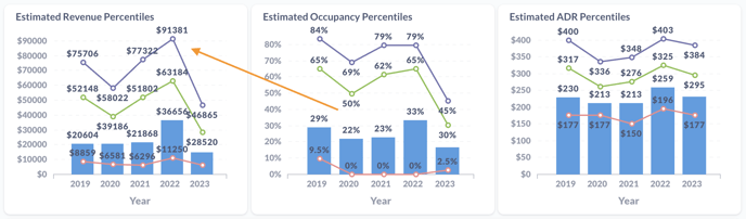
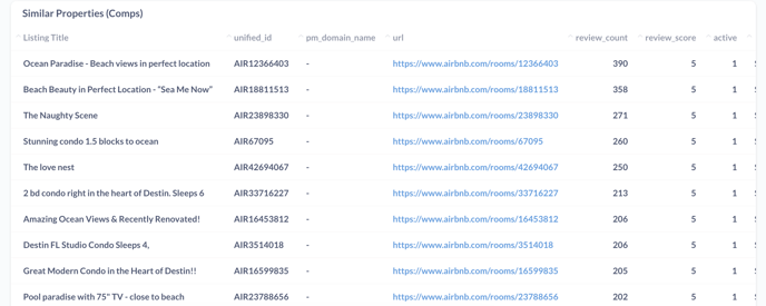
Just a little below this you would see the Supply list of the listings present in the filters you've selected:
Followed by the more descriptive ADR and Occupancy percentiles:
ADR: